Update: LibreOffice has cancelled the competition and apologized.
Update: People have criticized this article as being flamebait or overly emotional. I would have to agree. This article was not as well written as it should have been which is hypocritical. Because of this, I am going to unpublish it soon now that it has done it’s job. LibreOffice Design Team has admitted fault and so their is no reason for this article to exist as a pillar of past mistakes.
Recently LibreOffice held a design contest to create a mascot for the software. This has been a complete catastrophe and shows the LibreOffice design team to be incompetent when it comes to organization, design, communication, communication, and a fundamental understanding of marketing. They not only were bias, but also outright lied about or dodged reasoning for removing contenders from the competition. Throughout the process they didn’t take input, and still haven’t taken actions to correct their mistakes.
The current contenders show that they took the safest path possible and ended up with complete shit. Mascot design is normally about bold statements that unite the community under one personality, which the LibreOffice team doesn’t understand. No matter what they choose, they will alienate part of their community, so choose what will be best for the community damn it! Not the shit that is below.
Comments like “this is the ugliest mascot” will be taken as spam. Please respect the work of volunteers.
This is censorship of valid criticism. They fundamentally do not understand how artistic interpretation is a subjective process and that any opinion is valid in some way. Claiming a mascot is ugly is not counterproductive, it is stating an opinion, and a valid one at that.
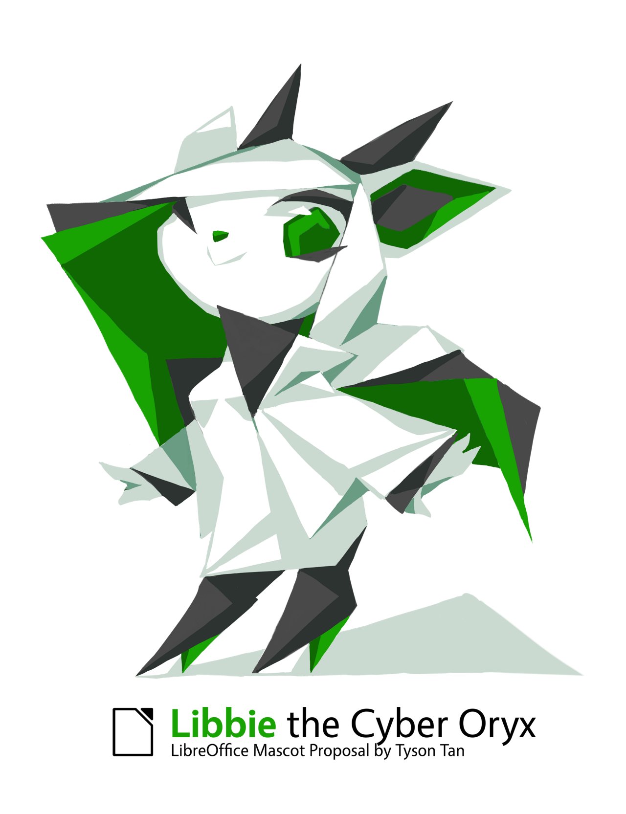
Libbie, despite any controversy over the actual design and character, was the only real unique mascot submitted. Libbie was controversial due to the fact that she was in an anime style which I can understand. There are older users of LibreOffice who might be slightly put of by the character, but that is kind of the result of instating any mascot. The same could be said about KDE’s Konqi but the KDE team was able to recognize the benefits of a cute character. Furthermore, Libbie is definately in the spirit of a more formal, less cartoony style that more fits the LibreOffice brand.
… many are not appropriate to the idea of LibreOffice, not usable as a mascot, or potentially copyright protected. We checked every image very closely to not violate other brands. Everything close to a known logo was also removed, for instance penguins, not only because of trademark issues but also to have a unique mascot….…We set up a couple of questions as golden thread withcuteness,mascotability,suitability, anduniqueness…
This is bullshit because under these already vague ideas, Libbie should have still been valid. LibreOffice doesn’t even have an established brand to begin with so how could Libbie not fit a non-existent brand?
Furthermore, LibreOffice in this article even admitted they made mistakes and made no effort to remedy them. They have ignored the hundreds of angry comments about how horrible the competition is.
Libbie also did what a mascot is supposed to do, which is gain a loyal following and fanbase of the mascot. Libbie has already done her job without even being the real mascot. Furthermore, Libby was designed by Tyson Tan which is responsible for KDE’s Konqi and Krita’s Kiki and has proven himself in the world of Linux mascot design. He was outright rejected after the design team later edited the rules to specifically out his mascot from the competition.
Weeks of research. A month to draw all those 40 pictures. 39 of them never showcased by the organizer. New contest rules added later, dismissing Libbie like trash. My passion and hardwork meant nothing to them.— Tyson Tan, Creator of Libbie
The LibreOffice design team needs a lesson in marketing and community building. Take Mozilla, Krita, and KDE as examples where they correctly interacted with their community. They all developed likable characters/logos that represented their characters and communities in a uniting way instead of just creating neutral spammy icons that have no utility, message, or emotion. Even VirtualBox is including characters in their software now that are not just bland icons. Even Microsoft Clippy was a better mascot then any of the current contenders because if nothing else, Clippy was memorable.
Furthermore, LibreOffice team, don’t make a fucking competition if you don’t give a shit about community opinion. The idea that LibreOffice has a design team is already a joke. I have read your articles and you clearly lack a fundamental understanding on UX, marketing, and aesthetics. The community has chosen Libbie anyways, so why not just make it official?
Update: To add to the clusterfuck, r/Linux has provided some additional info on this controversy.
Basically many of the icons that made it through the filter are officially stolen, despite LibreOffice Design Team saying they screened them. The Libre team also admitted to creating an echo chamber by deleting users and comments.
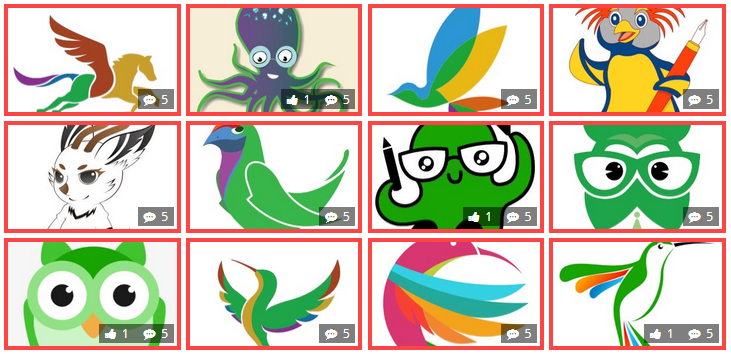
Additionally I found that this other extremely good contender was rejected early on:
That works perfectly for the LibreOffice “brand” The Libre Owl was in fact a part of a suite of mascots. In context they do not resemble the Duolingo logo but the design team only displayed the green one in the competition. Additionally many people have cherry picked similar icons from stock image websites but there is proof that these are original.